
You've crafted a well-researched, 2000-word article, but the bounce rate is high. Users seem to land and leave. The problem often isn't the quality of the information, but its delivery. An article's structure acts as a roadmap, guiding the reader from their initial question to a satisfying answer. Without a clear, intuitive path, even the most valuable content can feel like a dense forest with no trail. This disconnect damages user experience, which search engines now treat as a critical ranking signal.
Optimizing article structure for user experience means designing your content for how people actually read online. It's about respecting their time, anticipating their questions, and making the journey effortless. This approach directly impacts key metrics like dwell time, scroll depth, and pogo-sticking. The goal is to create content that not only ranks but also fulfills its purpose, whether that's informing, persuading, or driving a conversion. This guide provides a practitioner's framework for structuring content that performs.
How poor structure sabotages your content goals
Imagine landing on a page looking for a specific solution. You're met with a wall of text, no clear headings, and the key point buried in paragraph seven. Your immediate reaction is to hit the back button. This scenario illustrates a fundamental failure in content architecture. Poor structure creates friction, and friction is the enemy of engagement. It tells the reader the work of understanding is on them, not you.
From an SEO perspective, this friction sends negative quality signals. Google's algorithms, refined through initiatives like the Page Experience update and the helpful content system, are increasingly adept at measuring user satisfaction. A page where users consistently leave quickly or fail to scroll indicates a mismatch between the search intent and the content's presentation. The content might be technically relevant, but its structure makes it unusable.
In practice, we see this manifest in several ways. Content that dives too deep into background before stating the core answer frustrates the reader seeking a quick fix. Conversely, a structure that's too superficial for a complex, informational query leaves the user needing to search again. The most common pitfall is the lack of a clear information hierarchy. Without it, the reader's cognitive load increases, and their ability to find, process, and retain information plummets.

The user experience signals that matter to search
While Google doesn't reveal its exact recipe, public documentation and industry testing point to specific user behavior metrics that correlate with content quality. Dwell time, or how long a user spends on a page before returning to the search results, is a classic signal. A well-structured article that answers questions sequentially keeps readers engaged longer. Similarly, scroll depth measures how far down the page a user goes. A logical structure with compelling subheadings encourages deeper scrolling.
Another critical behavior is pogo-sticking. This occurs when a user clicks a search result, quickly realizes it's not what they need, and jumps back to try another result. It's often a direct result of a misleading title or an opening paragraph that fails to immediately confirm the page's relevance. Your article's introductory structure must act as a handshake, instantly affirming to the user, "You're in the right place."
These behaviors are not just abstract metrics. They represent real human reactions to your content's usability. Search engines use them as proxies for relevance and satisfaction. Therefore, structuring your article with clear signposting, scannable sections, and a logical flow isn't just good writing; it's a fundamental technical SEO requirement for the modern web.
Building the foundation: Information hierarchy and intent mapping
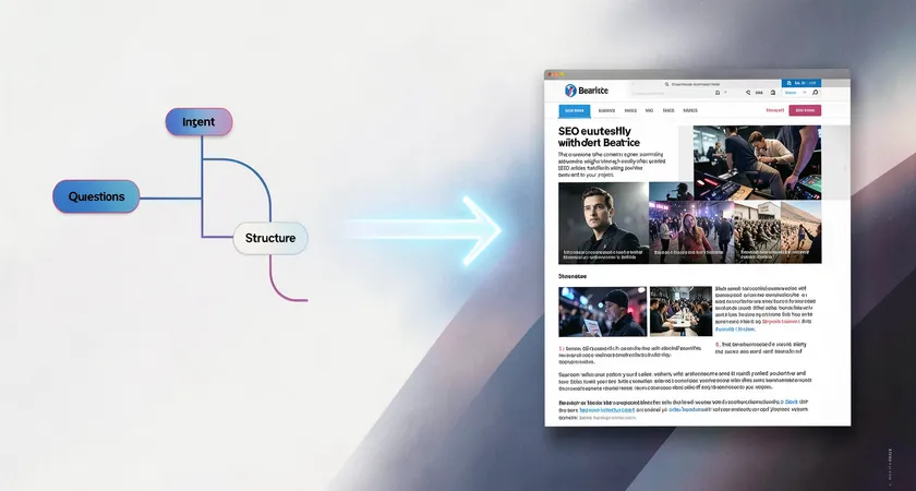
Before writing a single sentence, you need a blueprint. This starts with defining the primary user intent with surgical precision. Is the searcher looking to learn, to compare, or to make a decision? The article's entire skeleton must be built to serve that single intent. A "how-to" guide has a different optimal structure than a product comparison page. Misjudging this is a foundational error that no amount of polish can fix.
The next step is mapping out the user's likely secondary questions. Think of this as creating a conversation tree. If someone searches "optimizing article structure," what will they ask next? They might wonder about ideal heading tags, the role of visuals, paragraph length, or tools for analysis. Each of these secondary intents becomes a candidate for an H2 or H3 section. This mapping ensures the article flows in a way that feels natural and comprehensive, covering the topic's logical adjacencies.
This hierarchical planning creates a clear table of contents in your mind. The primary answer forms the core thesis and introduction. Each secondary question becomes a major section, with its own mini-arc of problem, explanation, and application. This method prevents the common issue of articles that meander or present information in a haphazard, confusing order. It forces you to prioritize information by its importance to the user, not its ease of writing.

Core structural elements for a seamless reading experience
The introduction has one job: confirm relevance and promise value in the first 100 words. It must directly address the search query, acknowledge the reader's probable situation, and succinctly state what they will gain by continuing. Avoid lengthy preambles or philosophical musings. Get to the point. A strong opening uses the primary keyword naturally and sets the stage for the detailed information to follow.
Headings are your most powerful structural tool. An H2 should clearly announce a new, substantive topic within the article's scope. It answers a clear sub-question. H3s break that topic down into specific facets or steps. The language should be benefit-oriented or plainly descriptive, not cryptic or clever. A heading like "The Impact of Sentence Length" is clearer than "The Rhythm of Readability." This clarity helps both users and search engines understand the content's organization.
Paragraph and sentence structure within these sections is equally vital. Online readers scan. Long, dense paragraphs are intimidating. Break ideas into manageable chunks of 2-4 sentences. Vary sentence length to create a natural rhythm. Use a short, punchy sentence to emphasize a key point. Follow it with a longer, explanatory one. This variation makes the text feel dynamic and easier to process, reducing reading fatigue and keeping the user moving down the page.
Strategic formatting with bold and italics can guide attention, but must be used with restraint. Bold key terms or the core takeaway of a paragraph to aid skimmers. Use italics for emphasis on a single word or for technical terms on their first use. Overuse dilutes their impact and creates visual noise. The goal is subtle highlighting, not a highlighter explosion across the page.
Integrating visual and interactive anchors
Text alone, no matter how well-structured, can become monotonous. Visual elements serve as cognitive landmarks, giving the reader's brain a momentary rest and reinforcing key concepts. A relevant image, chart, or diagram placed after a complex explanation can aid comprehension. More importantly, these elements break the vertical flow of text, creating natural pause points that make a long article feel less daunting.
The placement of these anchors is a structural decision. They should appear at logical intervals, typically after a key concept has been introduced in text. A good rule of thumb is one visual anchor for every 300-500 words of dense copy. Never place two images back-to-back, as this can disrupt the reading flow just as much as a text wall. The accompanying caption is prime real estate, offering a chance to summarize the adjacent point or pose a question that leads into the next section.
For certain types of content, interactive elements like expandable FAQ boxes, tabbed interfaces for comparing options, or embedded calculators can dramatically enhance UX. These tools allow users to engage with the content on their own terms, customizing the experience to their specific needs. From a structural perspective, these are best placed where they answer a clear, discrete subset of questions, such as after the main explanatory body and before a conclusion.

The operational challenge of scaling structured content
Manually applying these principles to every article is a time-intensive editorial process. It requires a writer who is both a subject matter expert and an experienced UX designer. For a single flagship article, this investment is manageable. The challenge emerges when you need to produce a high volume of consistently well-structured content across different topics and writers. Style guides help, but ensuring every piece meets the same high standard for logical flow and scannability becomes a major bottleneck.
Inconsistent structure is a common quality issue in scaling content operations. One writer might excel at deep research but produce dense prose. Another might be breezy and scannable but lack depth. Without a unified framework, the user experience across your content library becomes erratic. This inconsistency can dilute brand authority and confuse your audience, as they never know what to expect from one piece to the next.
Maintaining this structure also requires ongoing audits. As user behavior and search algorithms evolve, what constituted a good structure two years ago might now feel dated. Auditing a large corpus of existing content to retrofit better headings, break up paragraphs, and insert strategic anchors is a massive, recurring project. It's often deprioritized in favor of new content creation, leaving a growing portion of your asset underperforming due to structural, not substantive, flaws.

Where in-house processes typically break down
The breakdown usually happens at the intersection of expertise and workflow. The SEO manager understands the need for structure but may lack the editorial skill to implement it at scale. The content writers understand narrative but may not prioritize the specific UX signals that impact search. The editor is stretched thin, focusing on grammar and brand voice, not the architectural audit of every piece.
Furthermore, the tools often used for planning, spreadsheets and basic word processors, are not designed for visualizing information hierarchy. They manage tasks and words, not user journeys. This leads to a disconnect between the plan and the final output. The brief says "include scannable headings," but the delivered draft uses vague or repetitive ones. Polishing this requires another round of revisions, slowing velocity and increasing cost.
This operational friction explains why many companies see diminishing returns on their content investment. Producing more content without a scalable, repeatable system for optimal structure leads to a library where only a fraction of articles achieve their full potential. The rest, despite containing good information, are handicapped by poor presentation.
Moving beyond manual structuring
To overcome these scaling challenges, forward-looking teams are systematizing structure. This goes beyond a template. It involves creating intelligent content models that define not just word count and keywords, but the required structural components for each content type. Is this a beginner's guide? The model dictates it must have a "key takeaways" box up top, H2s framed as questions, and step-by-step H3s. This model is then integrated into the briefing and editorial process.
Technology plays a key role here. Advanced content platforms and APIs can enforce these models programmatically. Imagine a system where a writer's draft is automatically analyzed for heading hierarchy, paragraph density, and keyword placement against the intended model. It could provide real-time feedback: "Your first H2 appears after 400 words; consider introducing major sections sooner," or "This paragraph is 8 sentences long; suggest breaking it up." This shifts quality assurance from a final, manual gate to an integrated part of the creation workflow.
The ultimate goal is consistency at scale. When every article, regardless of topic or author, follows a proven, user-centric structural pattern, you build trust with your audience and stronger signals with search engines. The content operation becomes more predictable and efficient. Writers spend less time on structural revisions and more on deep research and compelling prose, knowing the framework is already guiding them toward an optimal user experience.
Optimizing article structure for user experience is not a one-time task. It's a core competency that blends editorial craft with information architecture and operational design. It begins with a deep understanding of user intent and builds a clear, scannable path to satisfaction. The dividends are longer dwell times, lower bounce rates, and content that truly earns its place in the search results. For organizations publishing at scale, mastering this requires moving from ad-hoc craftsmanship to a defined, technology-supported system. The quality of your ideas deserves a structure that lets them shine.